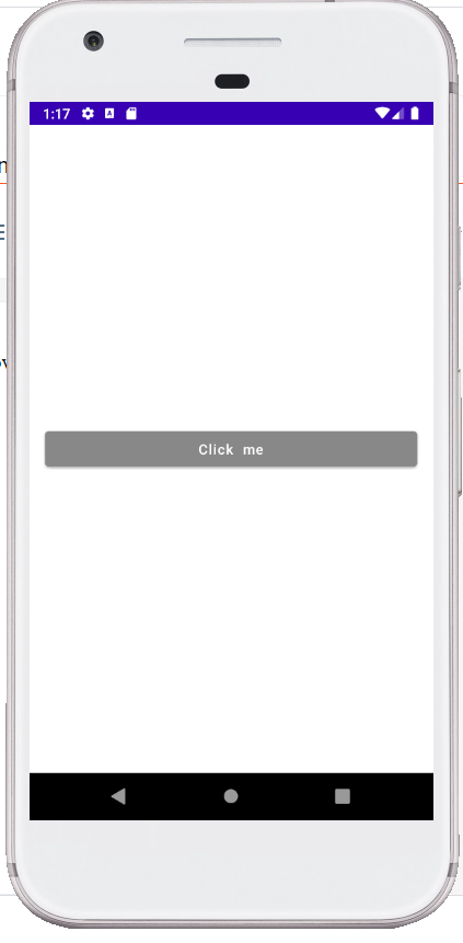
Today I am sharing a Sample of Jetpack Compose Button view. I will show you how
to set onclick listener on button in Jetpack Compose. How to style on Button in
Jetpack Compse , how to set height and width of button in Jetpack compose.
Code:
This file contains bidirectional Unicode text that may be interpreted or compiled differently than what appears below. To review, open the file in an editor that reveals hidden Unicode characters.
Learn more about bidirectional Unicode characters
package com.example.composesample | |
import android.os.Bundle | |
import androidx.activity.ComponentActivity | |
import androidx.activity.compose.setContent | |
import androidx.compose.foundation.layout.* | |
import androidx.compose.material.* | |
import androidx.compose.runtime.Composable | |
import androidx.compose.runtime.mutableStateOf | |
import androidx.compose.runtime.remember | |
import androidx.compose.ui.Alignment | |
import androidx.compose.ui.Modifier | |
import androidx.compose.ui.graphics.Color | |
import androidx.compose.ui.tooling.preview.Preview | |
import androidx.compose.ui.unit.dp | |
class MainActivity : ComponentActivity() { | |
private val showDialog = mutableStateOf(false) | |
override fun onCreate(savedInstanceState: Bundle?) { | |
super.onCreate(savedInstanceState) | |
setContent { | |
AlertDialogSample() | |
} | |
} | |
} | |
@Composable | |
fun AlertDialogSample() { | |
MaterialTheme { | |
Column( | |
modifier = Modifier | |
.fillMaxWidth() | |
.fillMaxHeight(), | |
verticalArrangement = Arrangement.Center, | |
horizontalAlignment = Alignment.CenterHorizontally | |
) { | |
val openDialog = remember { mutableStateOf(false) } | |
Button( | |
onClick = { | |
openDialog.value = true | |
}, | |
modifier = Modifier | |
.fillMaxWidth() | |
.padding(all = 16.dp), | |
colors = ButtonDefaults.buttonColors(Color.Gray) | |
) { | |
Text("Click me", color = Color.White) | |
} | |
if (openDialog.value) { | |
AlertDialog( | |
onDismissRequest = { | |
// Dismiss the dialog when the user clicks outside the dialog or on the back | |
// button. If you want to disable that functionality, simply use an empty | |
// onCloseRequest. | |
openDialog.value = false | |
}, | |
title = { | |
Text(text = "Dialog Title") | |
}, | |
text = { | |
Text("Here is a text ") | |
}, | |
confirmButton = { | |
Button( | |
onClick = { | |
openDialog.value = false | |
}) { | |
Text("This is the Ok Button") | |
} | |
}, | |
dismissButton = { | |
Button( | |
onClick = { | |
openDialog.value = false | |
}) { | |
Text("This is the cancel Button") | |
} | |
} | |
) | |
} | |
} | |
} | |
} | |
@Preview | |
@Composable | |
fun DefaultPreview() { | |
AlertDialogSample() | |
} | |
Hope this will help someone.
Enjoy Coding........... :)
this really helped me, thanks! :)
ReplyDeleteWelcome
Delete